
I can’t even type the word blush with out thinking of Steel Magnolias and the many words I live by that come from that movie.
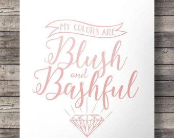
If you think you can’t live with out this sign you can order it on Etsy. Store name is SouthPacific
But I digress, which isn’t at all uncommon for me. The point of sharing this post is one of the many design trends that I’m really enjoying at the moment. We have seen gray for the last several years now and I don’t think its going anywhere any time soon, but like most things design is subjective and it evolves. Gray is a great back drop for any design scheme. Its neutral, theres literally over 500 different versions of it and to be honest my entire house is painted in one version or another. Most recently there has been a lot of copper/brushed gold/antique gold lighting, hardware, and sink faucets popping up in the Instagram/Pintrest world. That type of contrast with grey and white creates a wow factor and is anything but typical.
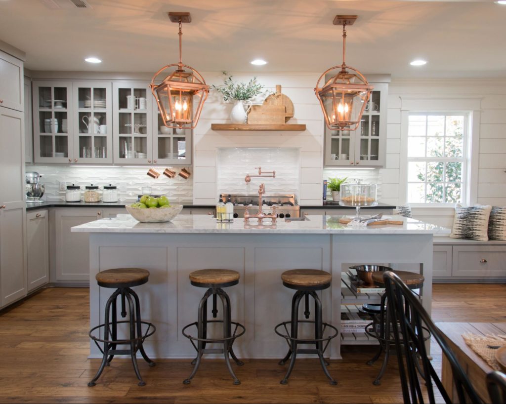
Photo courtesy of Magnolia Market
This contrast of cool and warm tones works well in the farmhouse look and a clean traditional look.
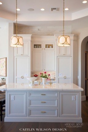
Photo Courtesy of Caitlin Wilson Design
So the big question will this go out of style? I don’t think so. At least not anytime soon. After all metal is just metal. I don’t think you should change every door knob, cabinet pull, faucet and light fixture in your house to copper or gold. In fact I don’t think they should all match. Good design is timeless, it’s cohesive and it allows for trends and taste to evolve.
So where does blush play into all of this? As an accent color of course. Can it be on the feminine side? Sure! I highly doubt there’s a group of men behind their computer at the moment searching for accent colors that compliment gray and copper, but I could be wrong! Here are a few examples of blush with gray and copper:
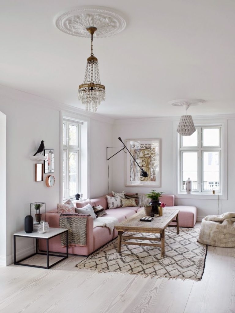
Photo was grabbed from Pintrest and original author was unknown.
This living area is so fun and cozy. Mixing the prints, textures and different shades of blush makes me want to get on that couch and watch Netflix for days.
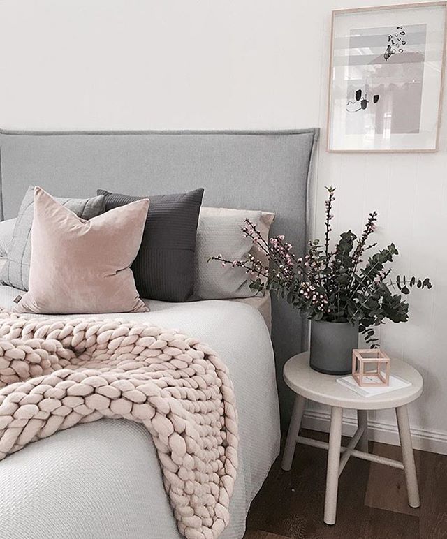
Photo was grabbed from Pintrest and original author was unknown.
The bedroom above is a much more subdued version of using blush as an accent than the living room. At the same time it is tranquil soft and not as feminine.
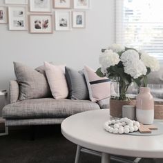
Photo was grabbed from Pintrest and original author was unknown.
At the end of the day accent colors and accessories don’t have to be timeless and thats the fun part of design evolving. Some days I have only navy and white pillows in different patterns and textures, the next I could bring in a pop a color if I’m feeling feisty. Try something new or out of your comfort zone. I hope you are as inspired by this design trend as I am, or maybe you got a good laugh out of the Steel Magnolia’s reference. Either way I hope you encouraged to try some of these ideas in your living space.
All the best!
Nicole